
Recently at work I needed to produce a pie chart for some data that I had to crawl through using basic scripting. Pulling out the numbers, sorting, filtering, etc., was all tasks that I'm used to doing, but for graphing I normally use Gnuplot. But, Gnuplot can't do pie charts AFAIK, so I needed to look for another way.
I didn't want to use a spreadsheet for the task because I don't find them very scriptable. So, I turned to matplotlib, Python's uber-graphing library.
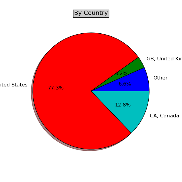
I found a simple example online, and before I knew it, I had a nice looking pie chart, with very little code.
# make a square figure and axes
figure(1, figsize=(6,6))
ax = axes([0.1, 0.1, 0.8, 0.8])

labels = []
fracs = []

for country in countries:
    count = countries[country]
    labels.append(country)
    fracs.append(count)

pie(fracs, labels=labels, autopct='%1.1f%%', shadow=True)

title('By Country', bbox={'facecolor':'0.8', 'pad':5})

show()
Very impressive. I tried it a few years ago and found it difficult, but it seems to have gotten much simpler. I must delve deeper now.
Comments !